

Not quite sure what to say about Pat’s Mothership palettes. Except that they’re stupidly good. End of. 😉 In all seriousness though, I think they really are unlike anything else on the market – fortunately, as they’re extremely pricy.
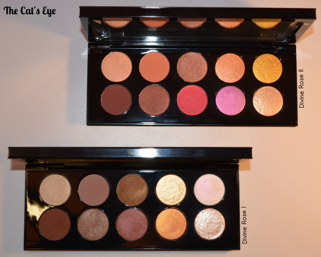
Recently she re-released the Divine Rose I, alongside a completely new Divine Rose II. I knew I’d really regret it if I missed out on the Divine Rose II, so I just went ahead and got it from her official site (I don’t think Selfridges ever received it). I already had the Divine Rose I, so thought to show you them both together:
Both Divine Rose palettes: clearly the II is much more colourful than the I, and overall warmer.
You don’t need both together, but they do complement each other nicely.
Without a doubt, both palettes are gorgeous. Not quite as much as Naomi Campbell (the face of Pat McGrath Labs and the muse for the collection), but… bout as close as one can ever get. 🙂
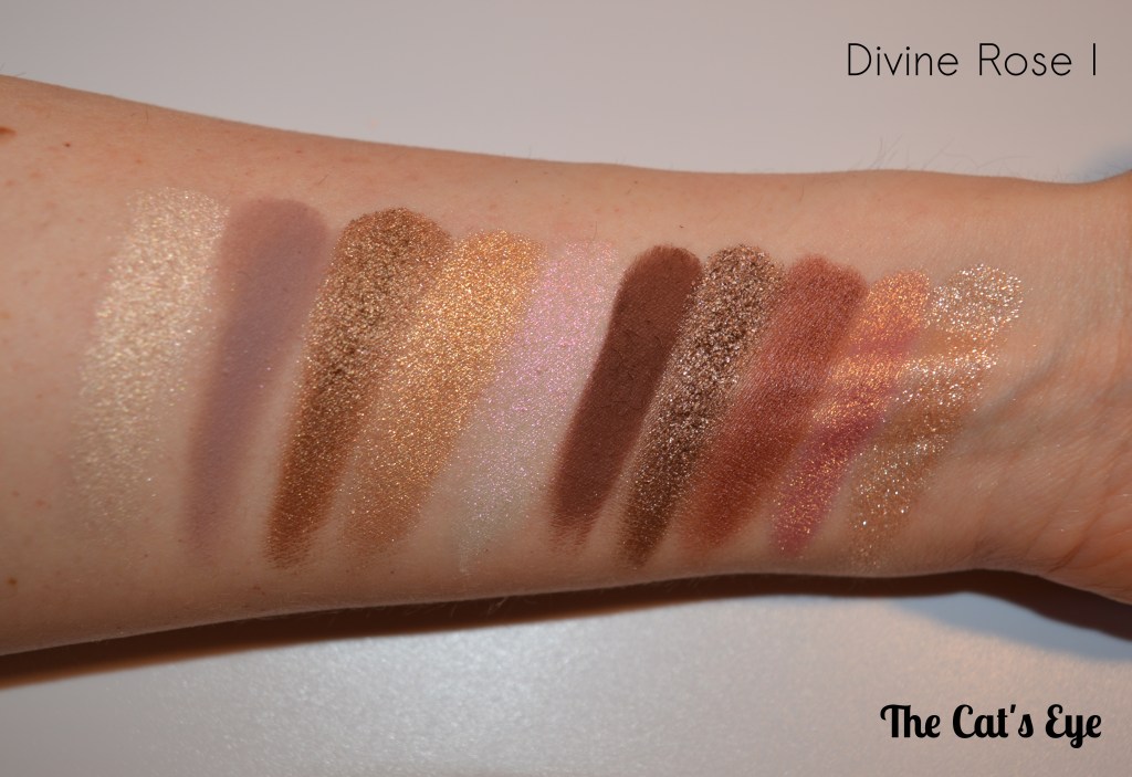
The Divine Rose I has quite a cult following and is considered the most wearable Mothership released by Pat. You can see why.
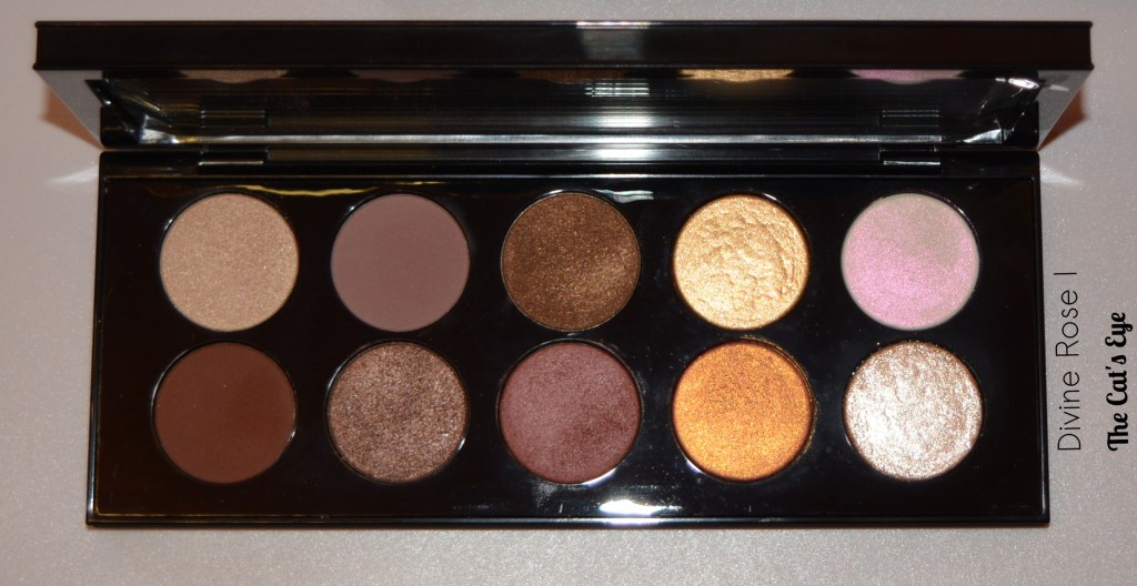
I really love the goth vibe of this palette – the colours look kind of dead, but in a way that is deeply interesting and fun, never boring. I will say though, I do find it difficult to restrain myself from using together all the six shades on the left-hand side, but when I do this, they tend to get a little bit muddy as the tones are fairly similar… That means having to plan a bit more carefully what to use in a look vs. what to leave ‘for next time’.
Think the colours speak for themselves… glorious palette.
Now let’s move on to the Divine Rose II. This a more daring version of the Divine Rose I. Sure, it’s bit less ‘wearable’, but I certainly do not mind that. Based on promo pictures online, I genuinely expected to love the look of this one more than the DR-I, but now that I have both, I am not so sure: I simply can’t choose between them. I don’t think either is ‘better’, or more beautiful than the other. They are just different – but equally stunning.
The DR-II follows the same structure as the DR-I, with the left corner including a satin brow bone highlight, a transition, and a deepening shade. But these are warmer than what is included the DR-I.
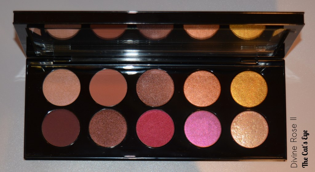
What can I say? This palette is just brilliant and I can’t wait to create some looks. Not even sure what to choose from this selection of shades, want to use them all!

Verdict?
I couldn’t really be any happier with these Motherships. I am so delighted to have them, and I have absolutely no regrets that I got the DR-II as well. If you think you can part with the money and the colour story appeals to you, I really don’t think you could possibly be disappointed! ❤
Lex
