
I’m back after a very long break! Let jump straight in:
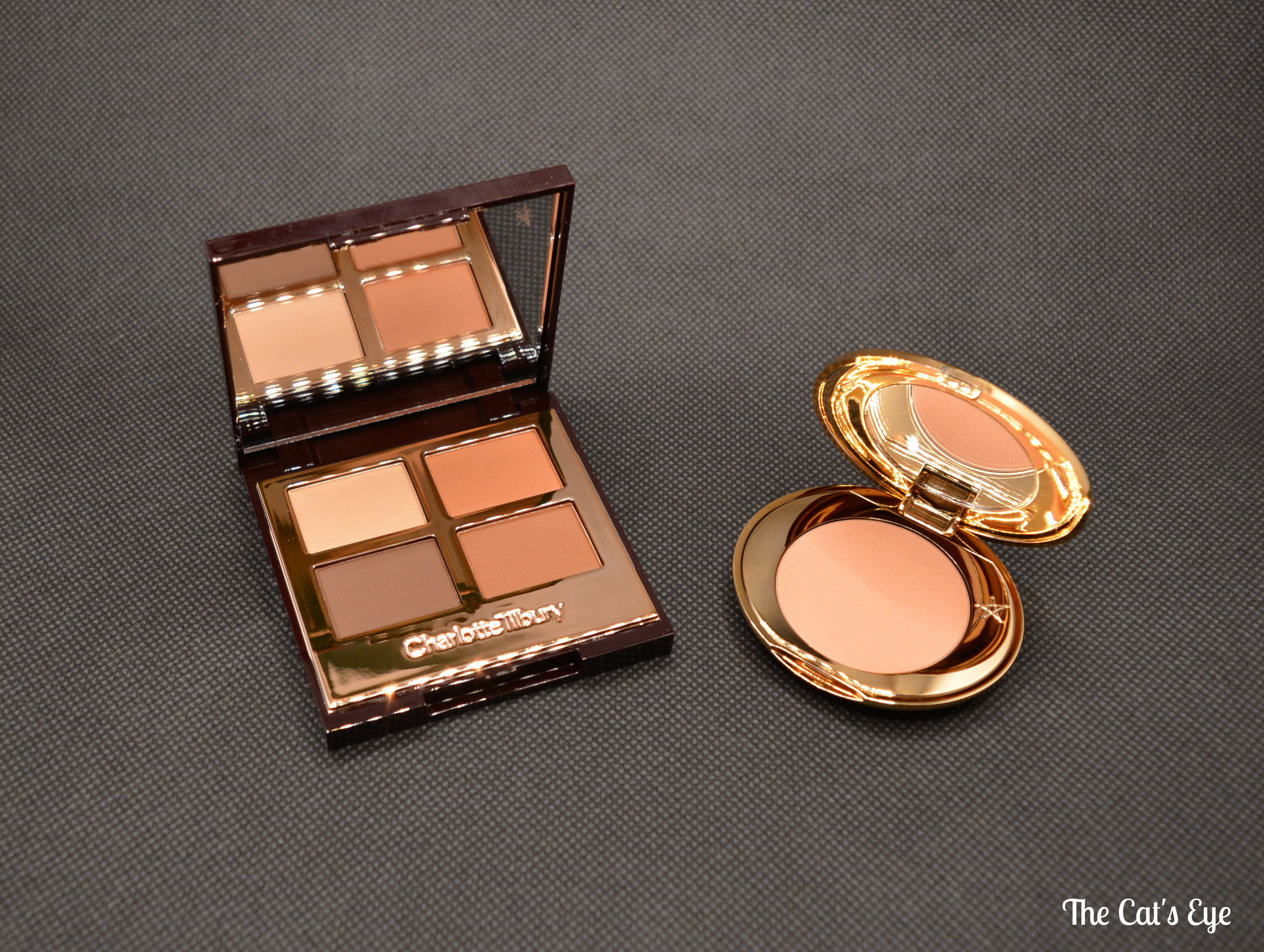
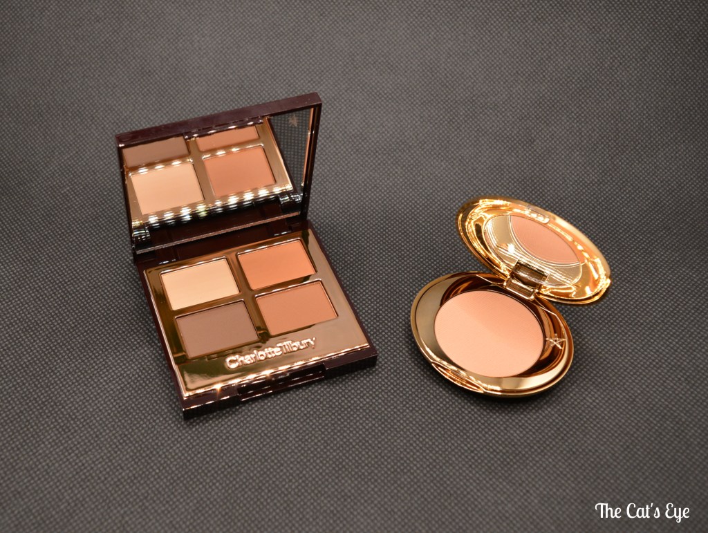
- The Charlotte Tilbury Desert Haze palette
I’ve recently received the new Charlotte Tilbury Desert Haze palette in the mail. Really excited to test it out on my eyes – but having swatched it, I’m expecting really good things.The shadows are buttery smooth and look very easy to blend.
The shade selection may seem basic, granted, so you might wonder why I bothered. Indeed, I suppose everyone must have a whole bunch (!) of neutral palettes by now. What got me really interested is the terracotta tone, combined with the smoky vibe. I don’t think that is very common actually – neutrals tend to be either cool-toned (like the Dior Backstage Eye Palette in 002 Cool Neutrals), or warm-toned in the sense that they look peachy, caramel-y or bronzy (case in point – the complementary Dior palette in 001 Warm Neutrals). Sometimes they might even veer off into pink territory, like the Huda Beauty Nude Obsessions in Medium.
However, what I think is often overlooked is this area of terracotta tones – that threaten to look orange, but never actually do (you do get palettes with warm browns and proper orange shades, like the Coloured Raine – Queen of Hearts). Charlotte Tilbury’s Desert Haze seems to have found the perfect balance in pigments, and structured the palette logically by including the lighter + the deeper smokey tone. This palette is as gorgeous as it is practical. ❤
Charlotte Tilbury’s Desert Haze quad and her Magic Vanish Colour Corrector in 2 Medium
Now to put my money where my mouth is:
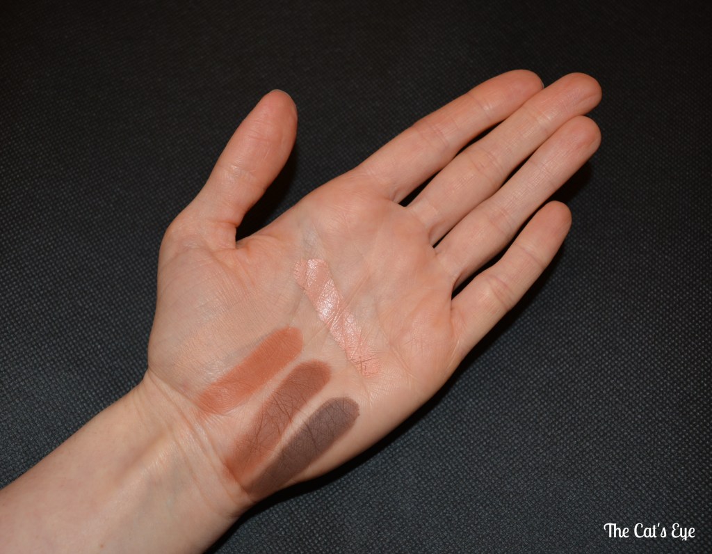
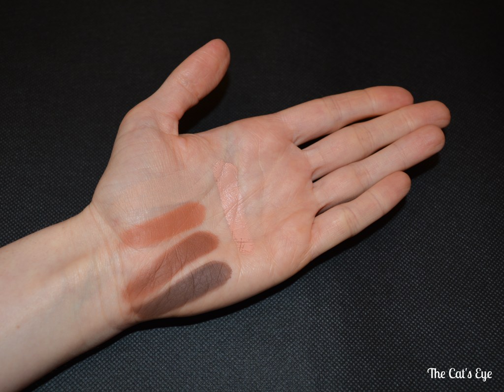
Here are some swatches of both products. You can see how pigmented the shadows are. They also felt really creamy when swatched. I expect easy blending since the shades almost wanted to ‘blend themselves’ a little towards the extremities of the swatches, without any effort on my part.
- Magic Vanish Colour Corrector in shade 2 Medium
I struggled somewhat to choose a corrector shade in between 1 Fair and 2 Medium. For a foundation, I’d definitely have gone for the lighter option, but since I have quite intense dark under-eye circles to correct, I wasn’t sure 1 Fair would cut it…
Now that I’ve received 2 Medium, I think it will work for those with fair skin tones, but with very intense dark circles (and under a suitably matched concealer). Otherwise 1 Fair would be fine for any ‘average’ under-eye darkness and a fair skin tone. For me personally, I think I can get away with the 2 Medium. I believe Mel Thompson went for the same shade in this video.
I will need to actually test this out during a normal day of wear to see how it behaves – here I am only including swatches. So I’ll try to update this post with a short note once I’ve actually worn both products. The corrector does look/feel relatively creamy, so I expect a setting powder will be necessary.
The corrector has a formula of average ‘stiffness’ – it is not as ‘rich’ as the Becca Under Eye Brightening Corrector, for sure. But it isn’t stiff or dry either – it just melts easily under your finger as you apply it.
Let me know your thoughts below if you have tried either of these already, would love to know!
Lex
